Wolters Kluwer office
Axial symmetry
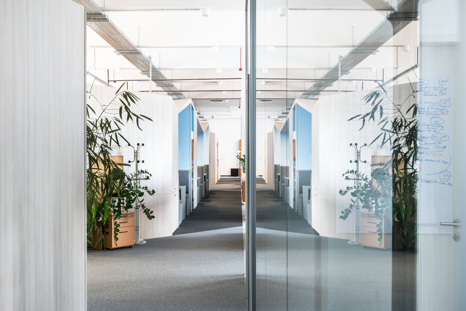
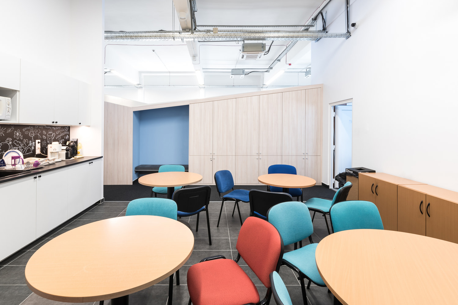
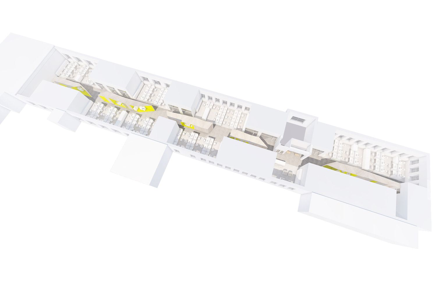
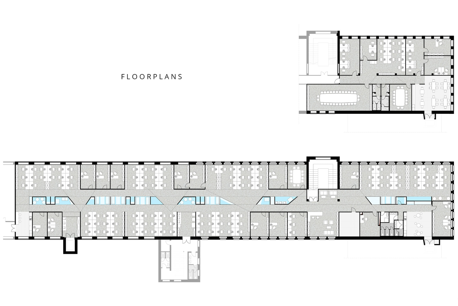
We created a layout and an interior design concept for the new tenant of the office space in the former chocolate factory. We only added the most neccessary elements to the rational and transparent layout of the long and narrow building. Along with the few separable offices we designed open workspaces where the original ceiling and the structure remains visible. The floor plan resembles the rythm of the concrete beams of the ceiling.
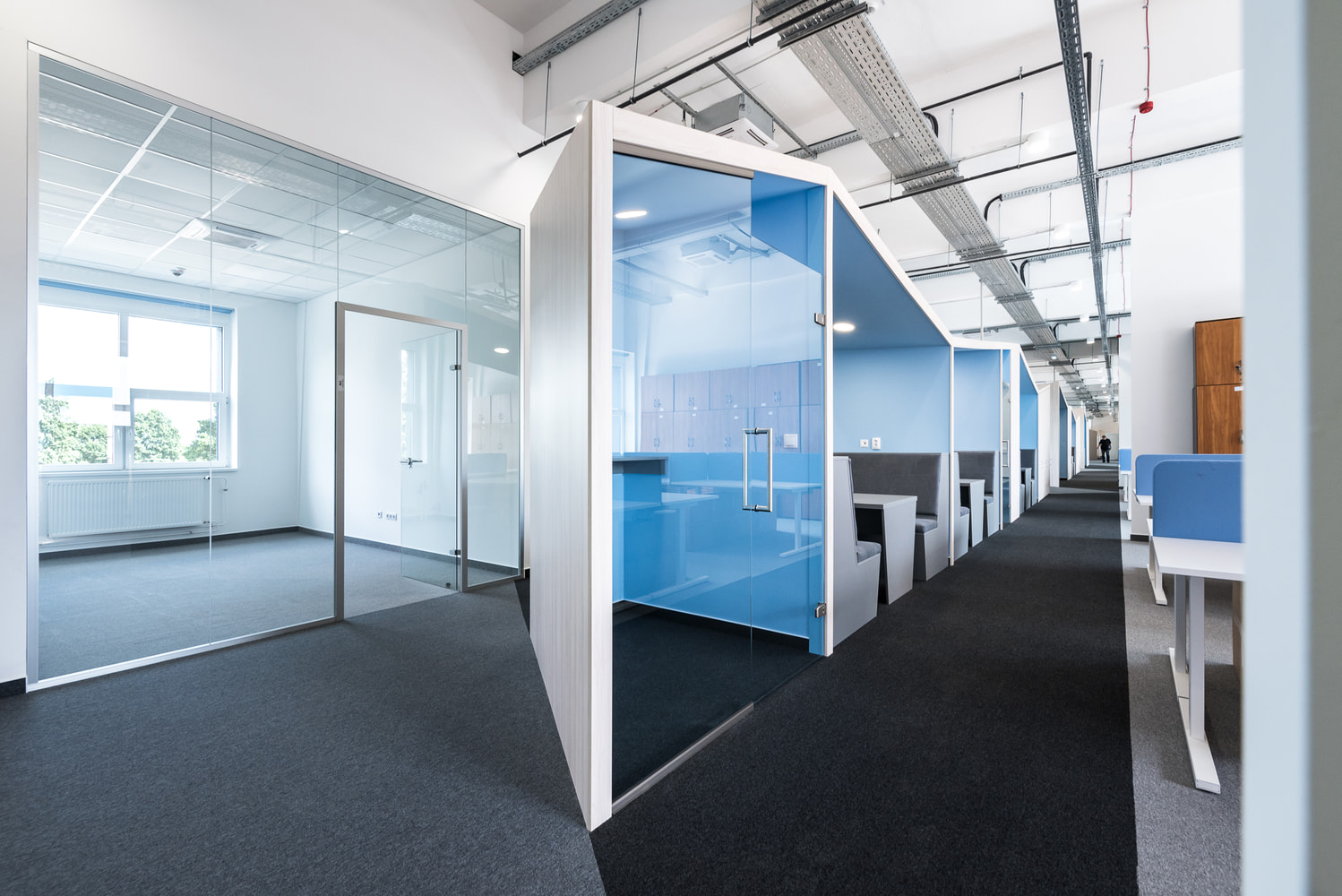
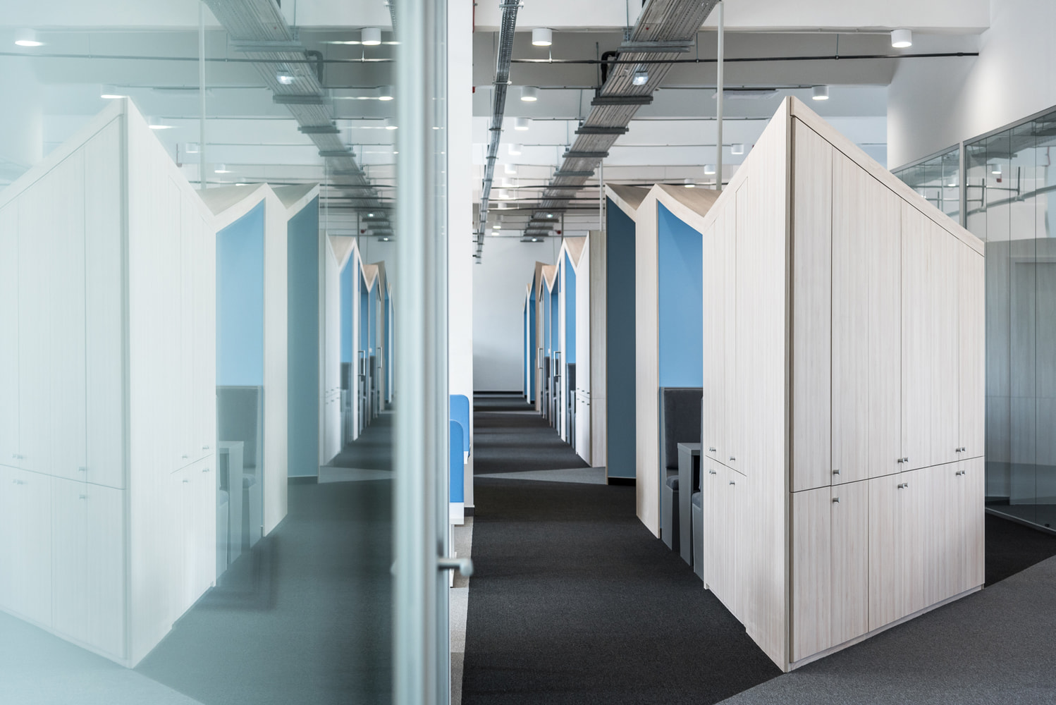
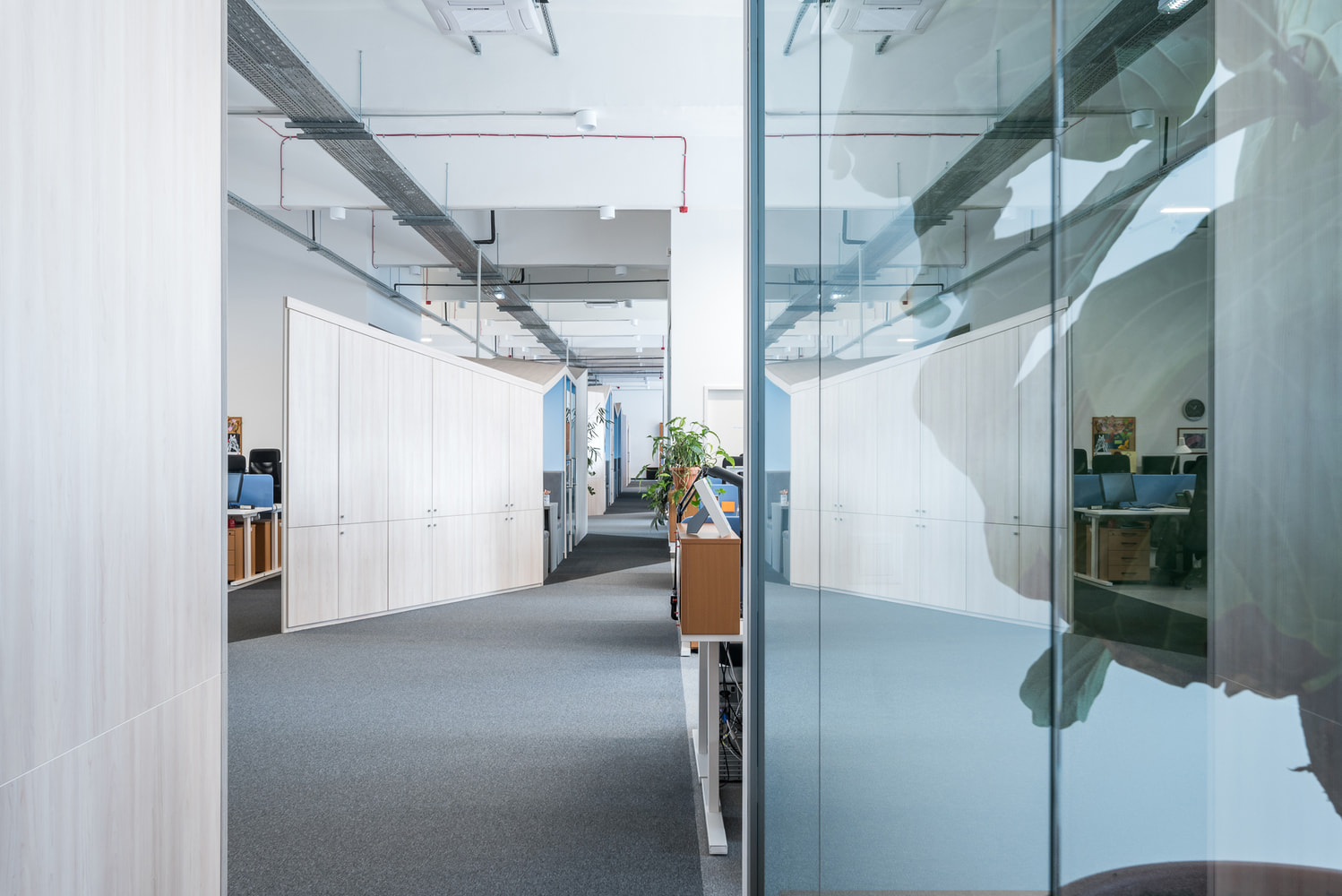
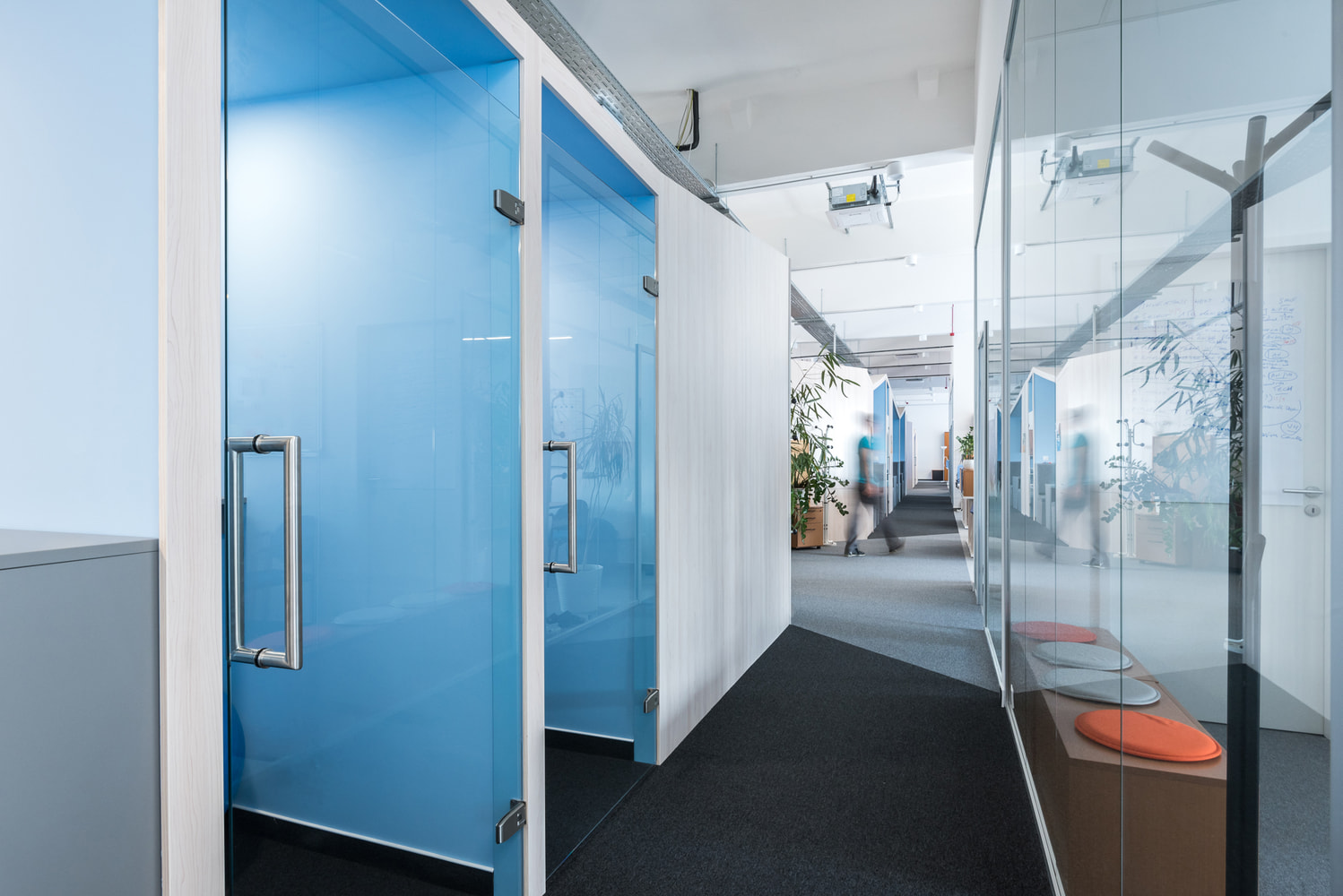
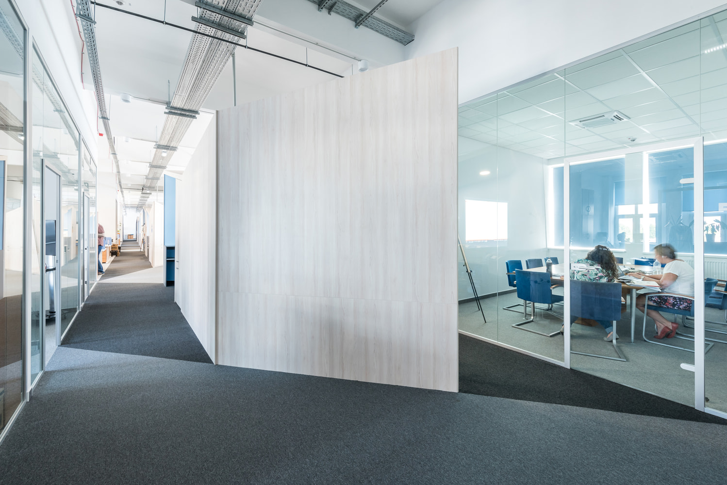
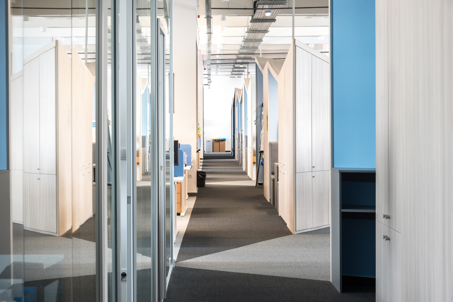
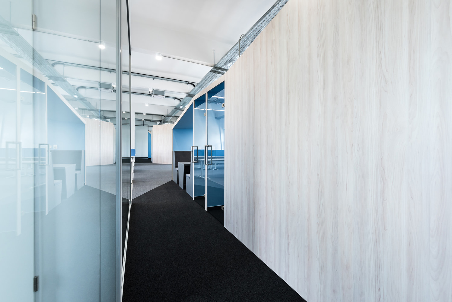
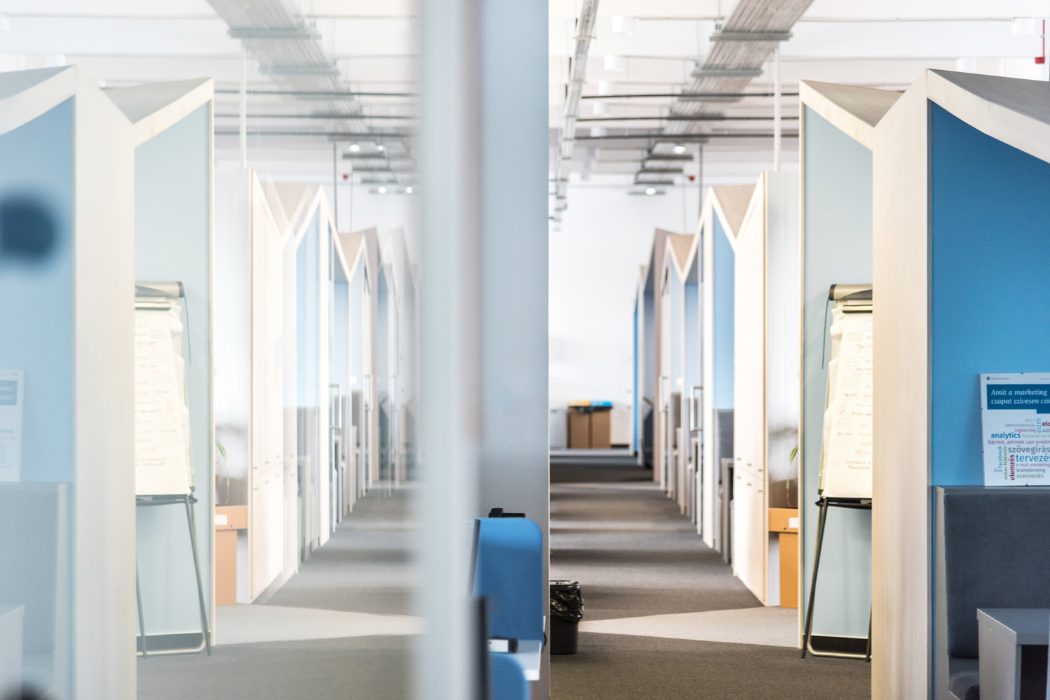
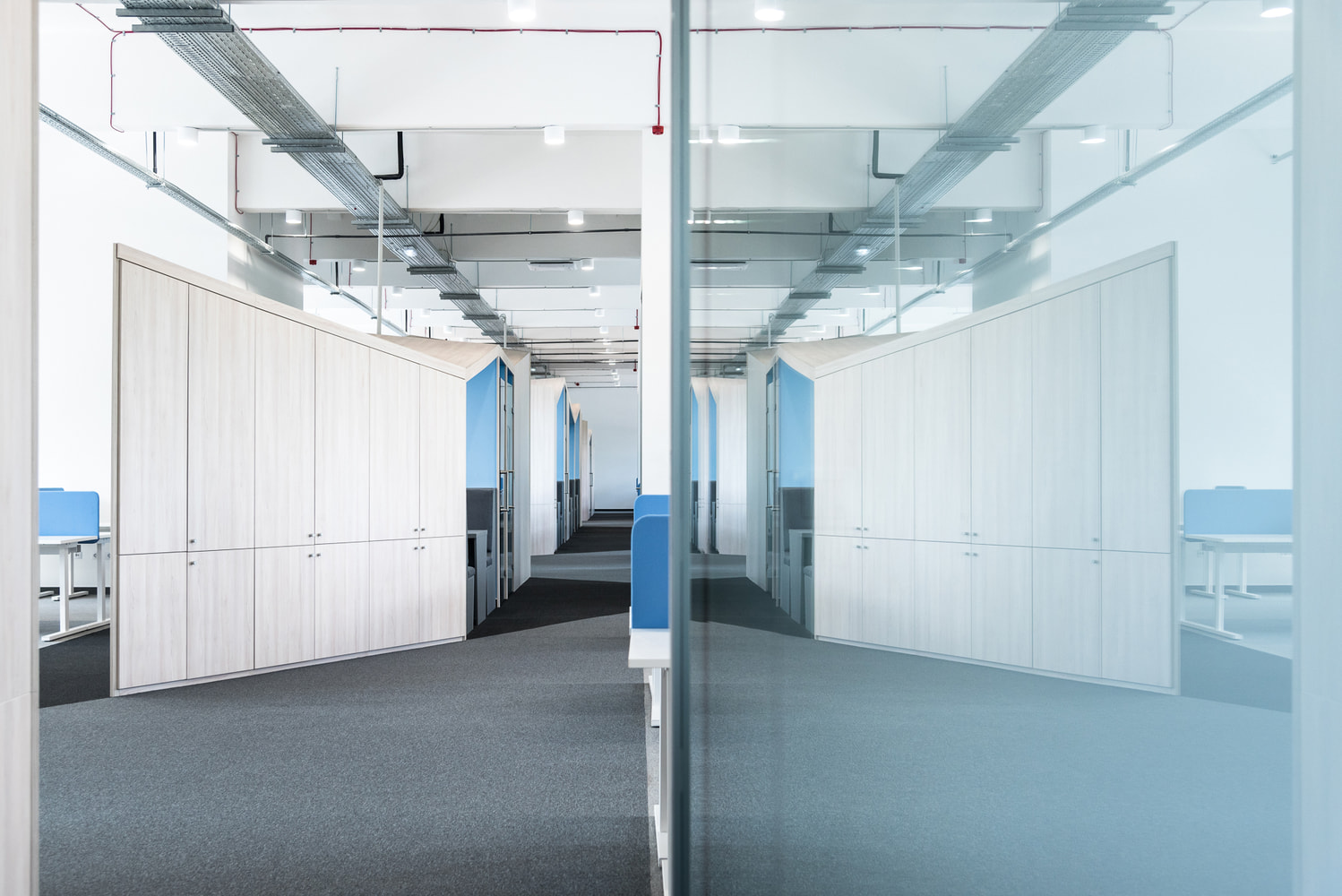
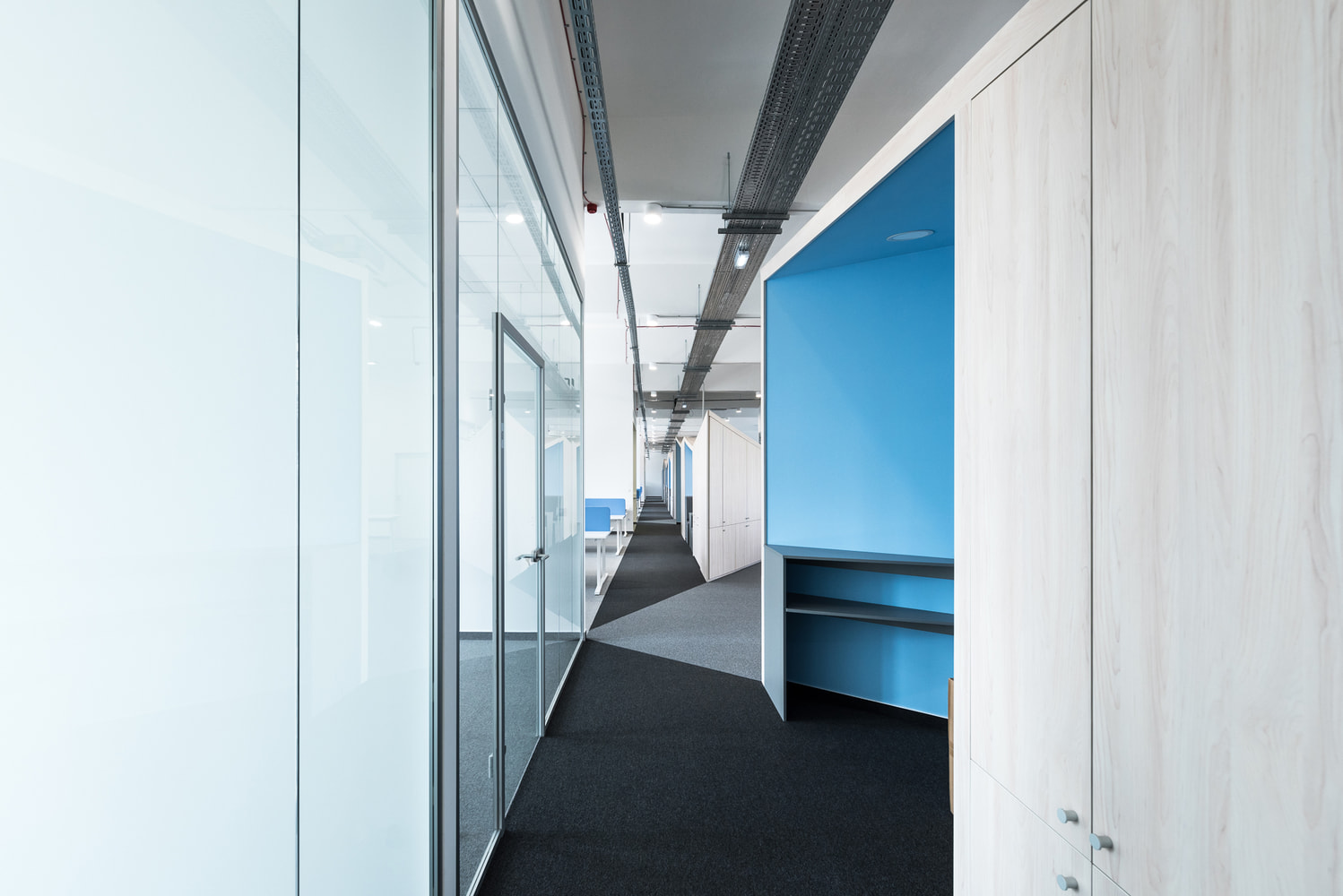
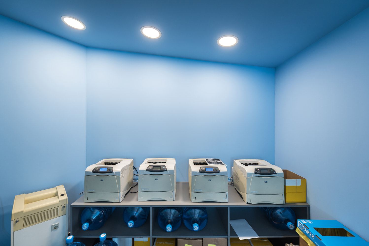
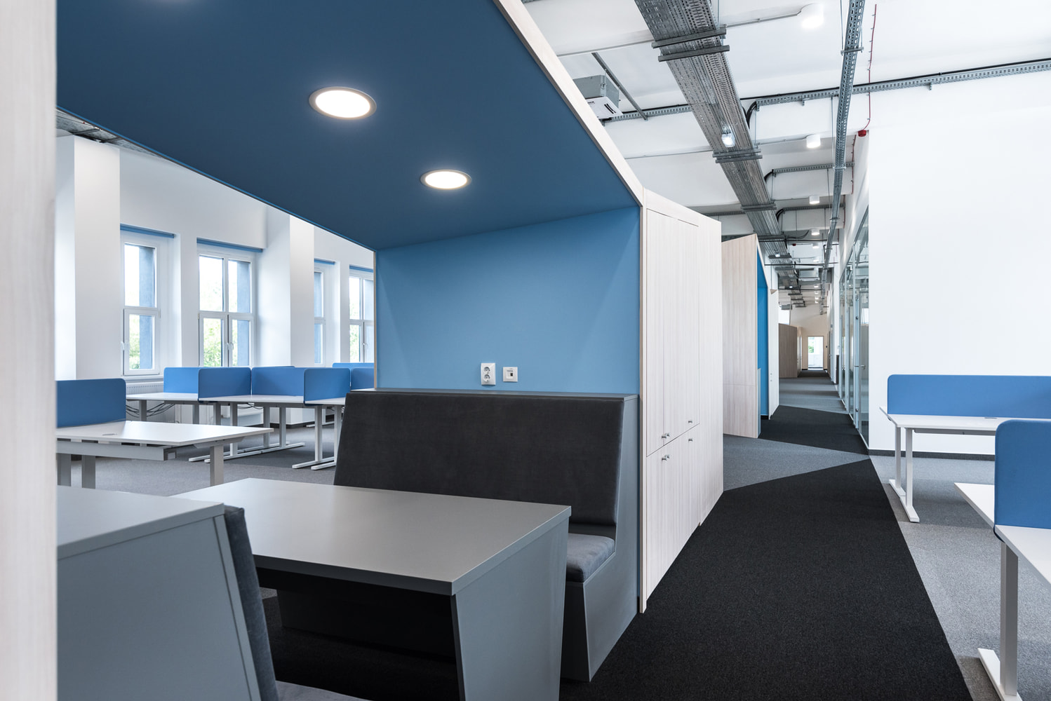
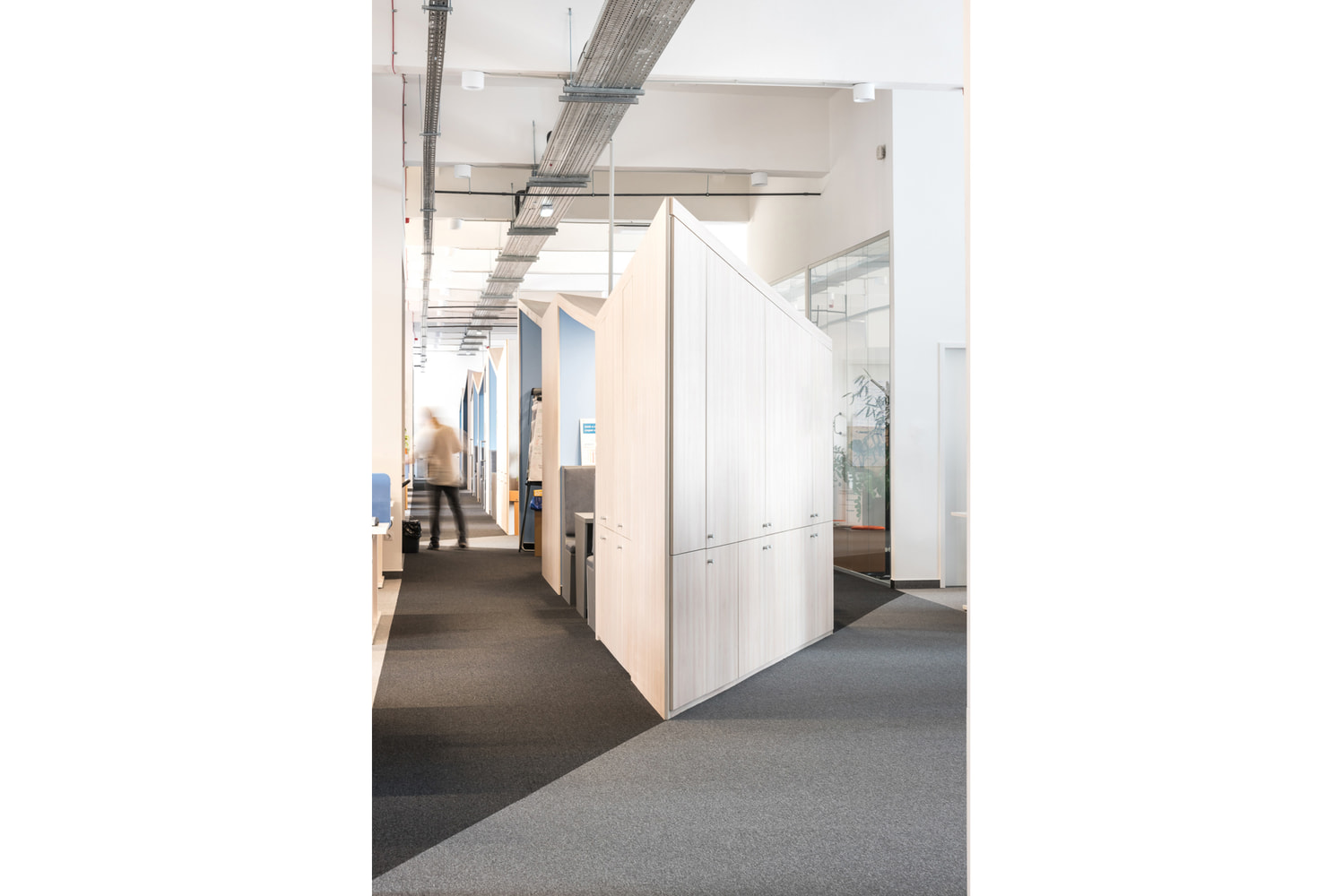
The layout structure created a long corridor in the middle that was calling for a creative, unique solution. We designed a long, playful structure that wiggles and worms through the space. This snake like furniture has multiple functions: it works as a chillout space and a meeting room, it has a copy nook and storage space, and it is a decorative element that divides the space and adds character. It breaks up at some point then starts again, opening up into different directions in the meantime. Its soft angles create a dynamic flow and defi…
Axial symmetry
We created a layout and an interior design concept for the new tenant of the office space in the former chocolate factory. We only added the most neccessary elements to the rational and transparent layout of the long and narrow building. Along with the few separable offices we designed open workspaces where the original ceiling and the structure remains visible. The floor plan resembles the rythm of the concrete beams of the ceiling.
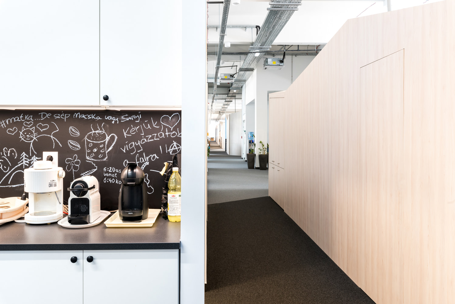
The layout structure created a long corridor in the middle that was calling for a creative, unique solution. We designed a long, playful structure that wiggles and worms through the space. This snake like furniture has multiple functions: it works as a chillout space and a meeting room, it has a copy nook and storage space, and it is a decorative element that divides the space and adds character. It breaks up at some point then starts again, opening up into different directions in the meantime. Its soft angles create a dynamic flow and define the direction of traffic in the office. The outside of the furniture is a light colored wood veneer and the inside is the shade of blue that resembles the brand colors of the tenant company and harmonizes with the rest of the furniture in the office. By adding glass doors here and there we created quiet nooks that are perfect to make an important phone call or get away from the buzz without having to leave the office.
This furniture is like the spine in the body or the bole of a tree: it straightens, organizes and defines the space.
More
Interior design concept and construction plans: Nóra Pajer, Noémi Soltész / 2018
Team: Norbert Juhász
Client: Buildton
Location: Lokomotív Office Building, Budapest
Size: 1500 m2
Photo: Norbert Juhász

