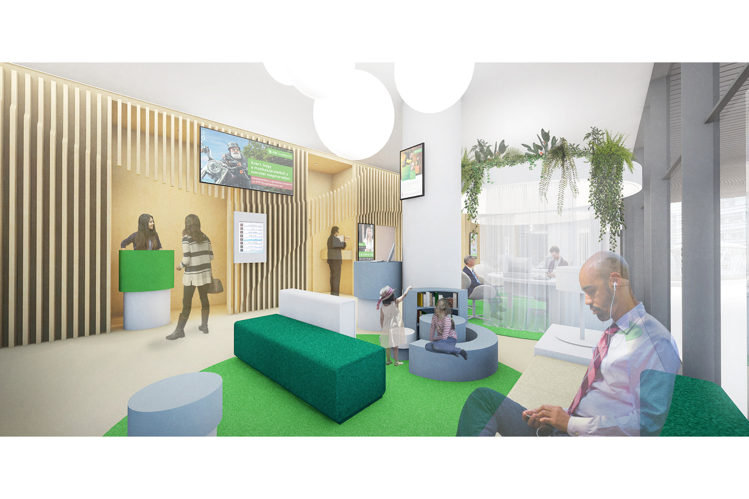
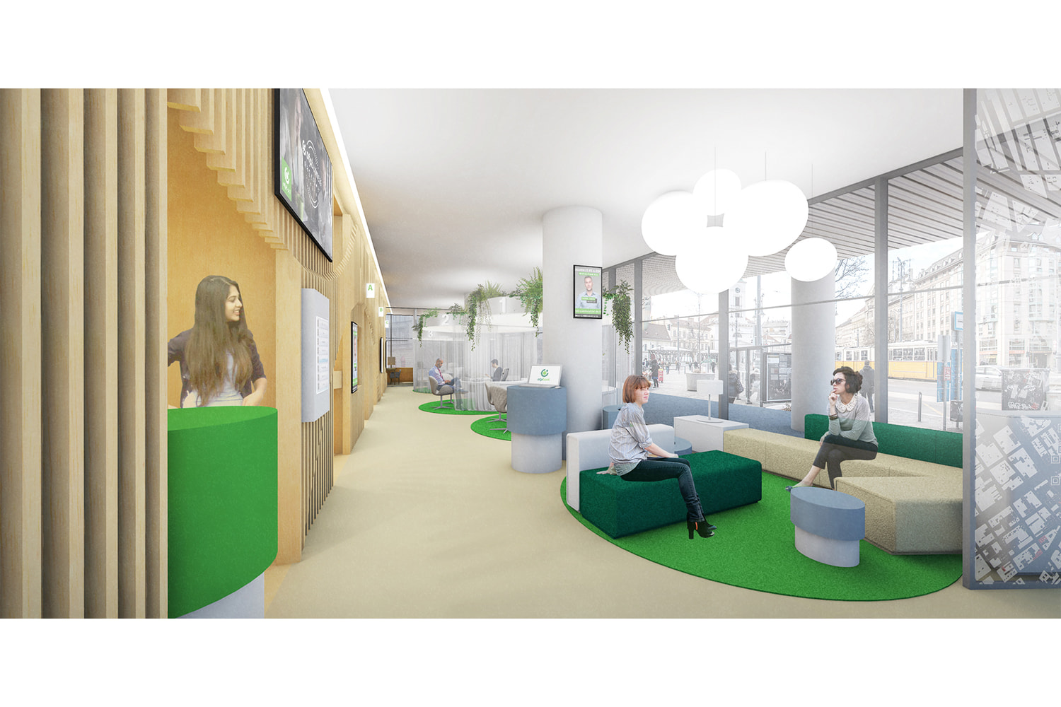
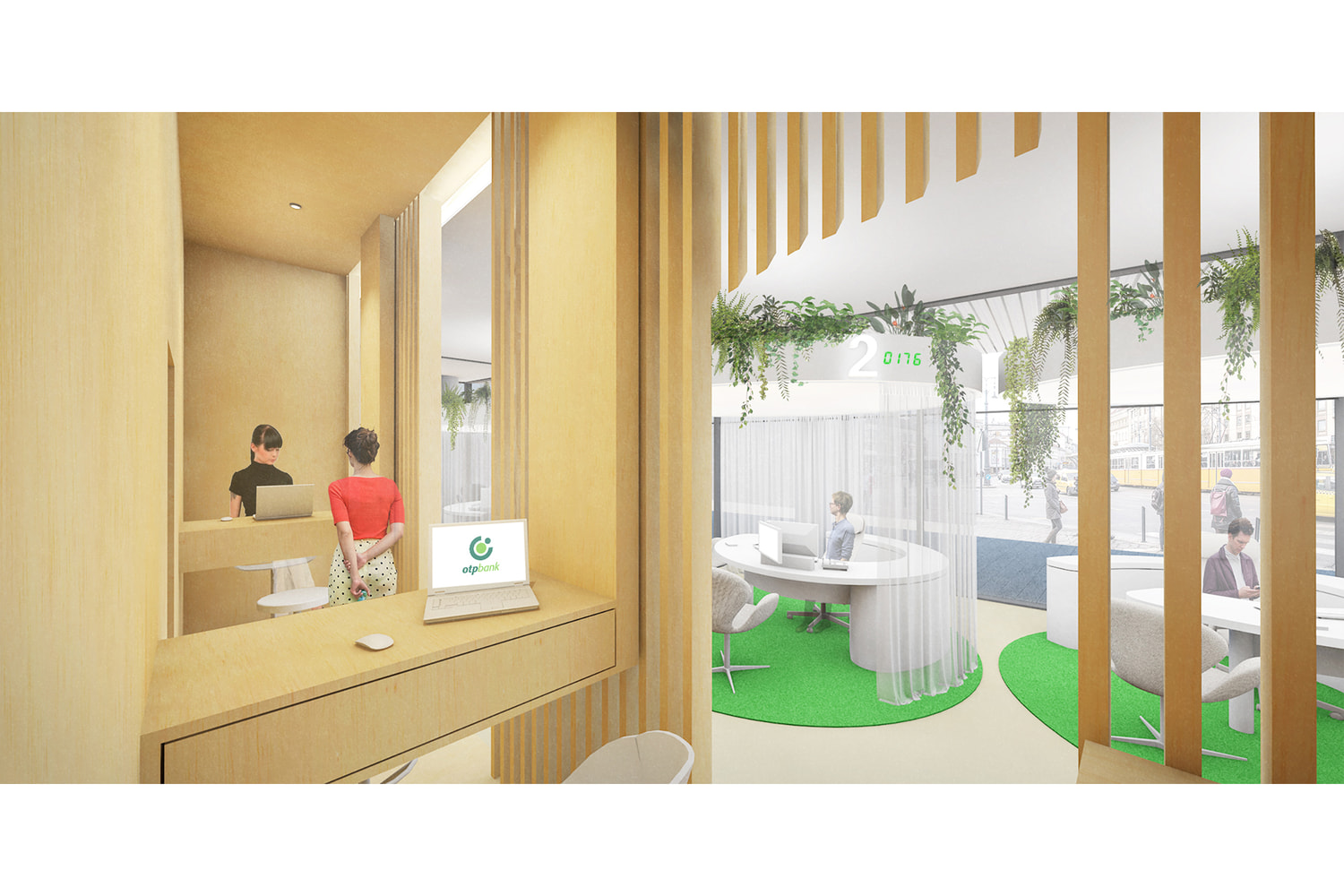
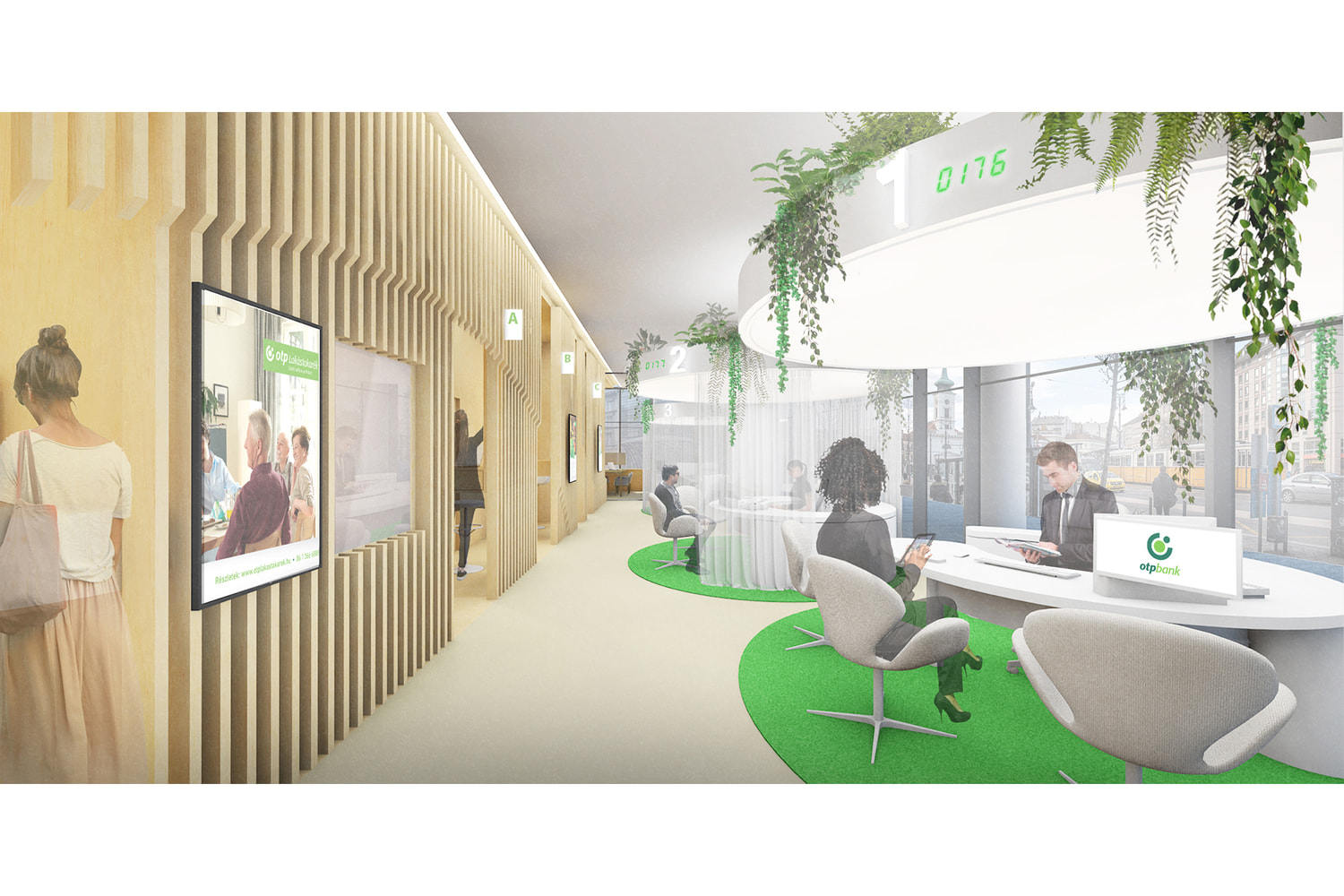
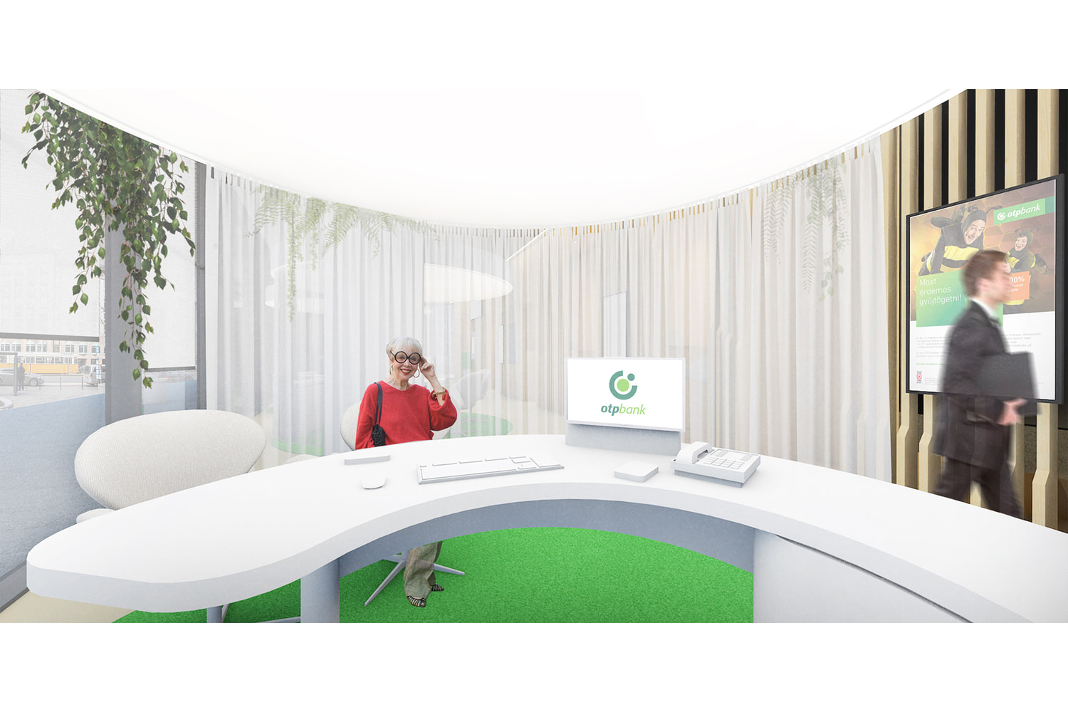
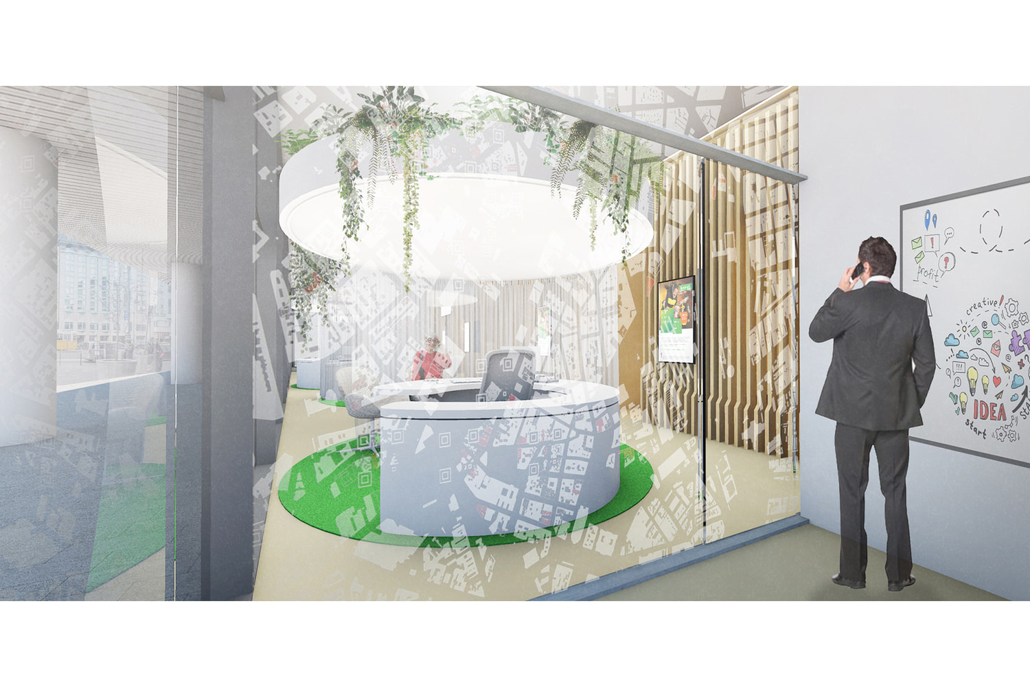
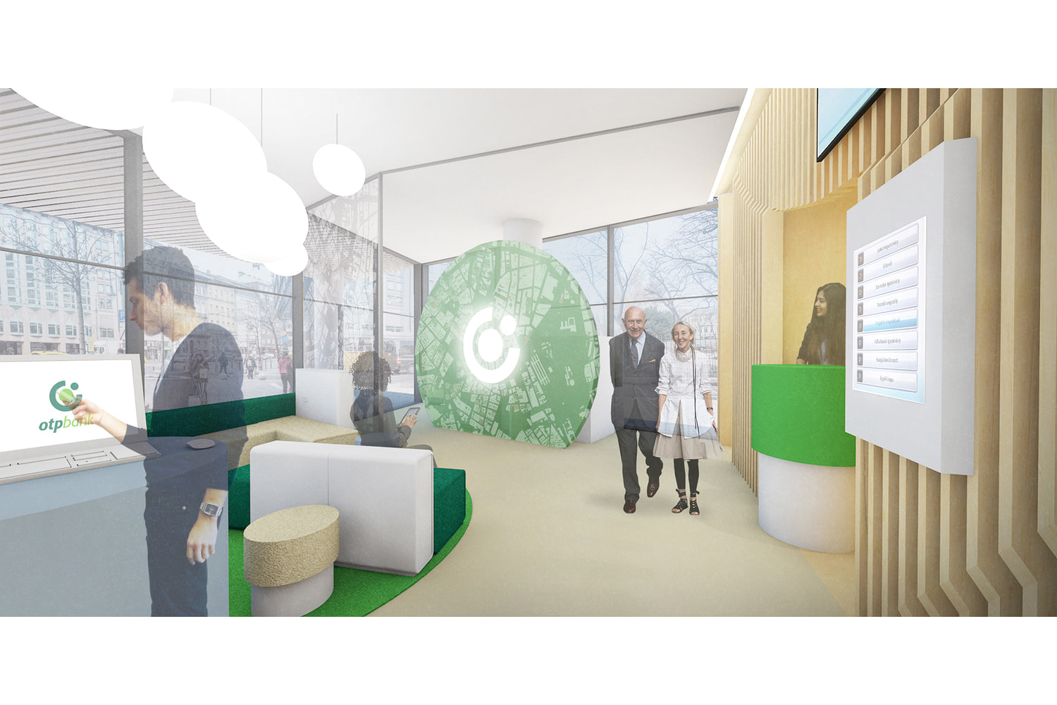
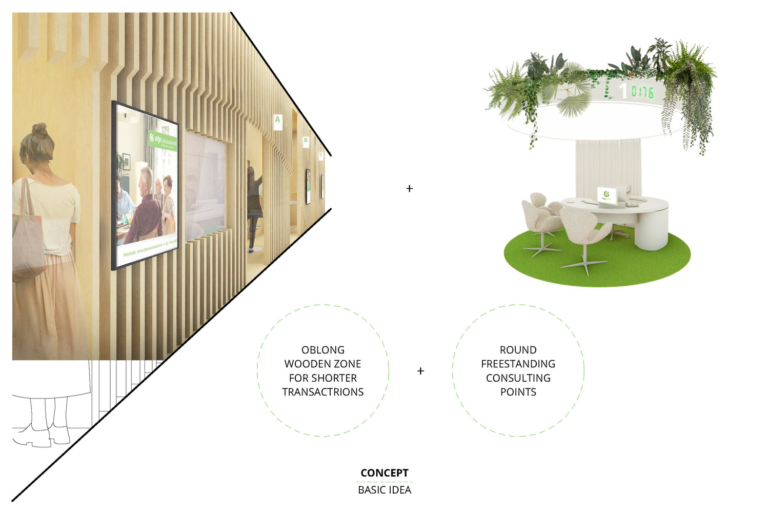
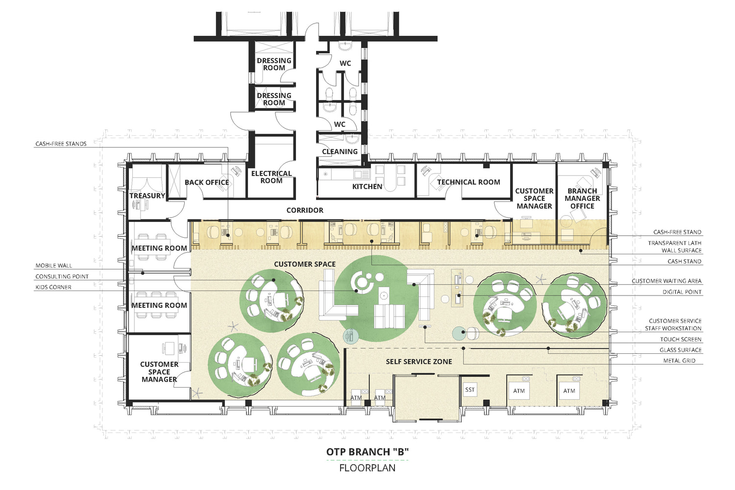
The design concept created for the invited competition of OTP offers adjustable, people-centered, and cost-efficient solutions, taking into account the bank's longterm customer service goals and its changing needs day by day. In the age of digital channels, the frequency of personal administration is decreasing, while the demand is tilting towards consulting services, which brings about the actual reorganization of bank branches. These two kinds of trends are represented in our work, reflecting the needs of today and near future.
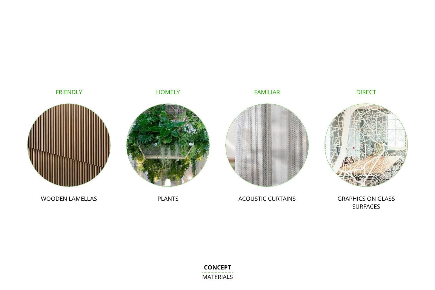
Since the comprehensible, partnership-expressing design was a basic requirement, we gathered materials, feelings, decor, and graphic elements around four ideas – friendly, homelike, familiar, easy – to illustrate them. In addition to general comfort, they also support the functional separation of the two types of customer traffic. Short transactions can be made in the fast service lane behind a wooden slatted wall, while longer ones can take place at the free…
The design concept created for the invited competition of OTP offers adjustable, people-centered, and cost-efficient solutions, taking into account the bank's longterm customer service goals and its changing needs day by day. In the age of digital channels, the frequency of personal administration is decreasing, while the demand is tilting towards consulting services, which brings about the actual reorganization of bank branches. These two kinds of trends are represented in our work, reflecting the needs of today and near future.
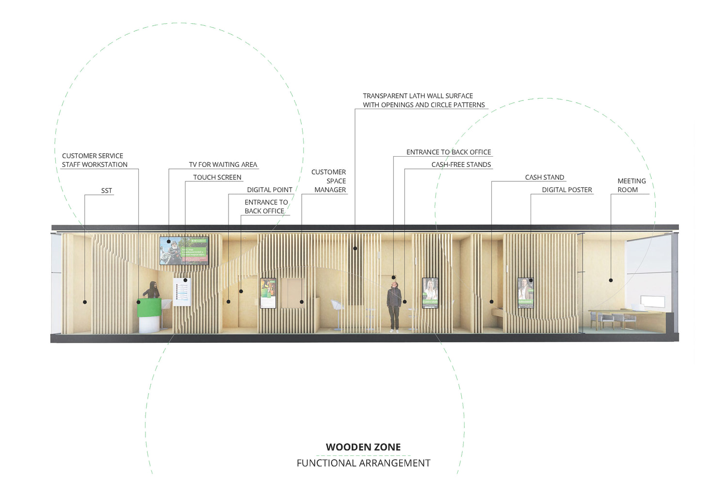
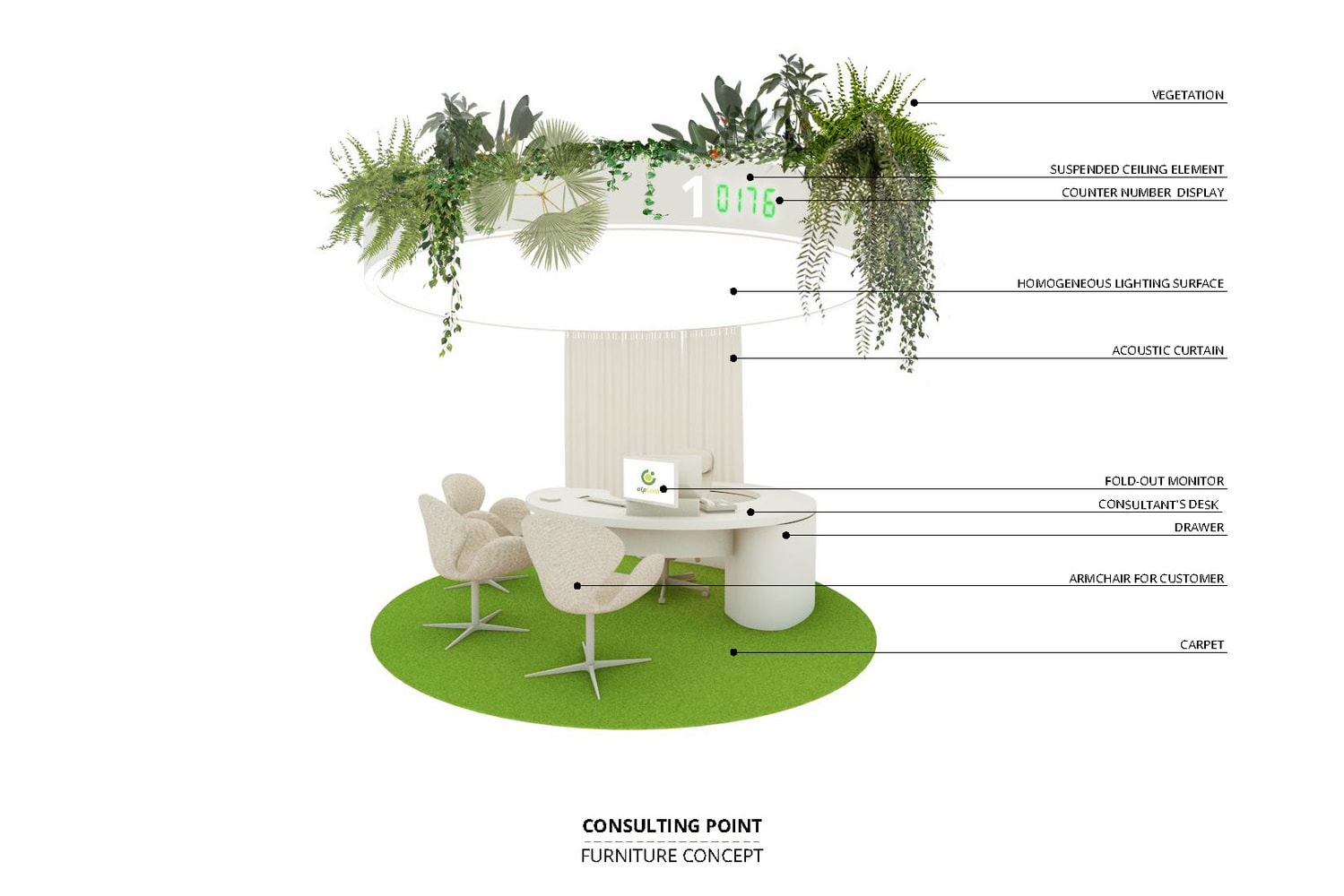
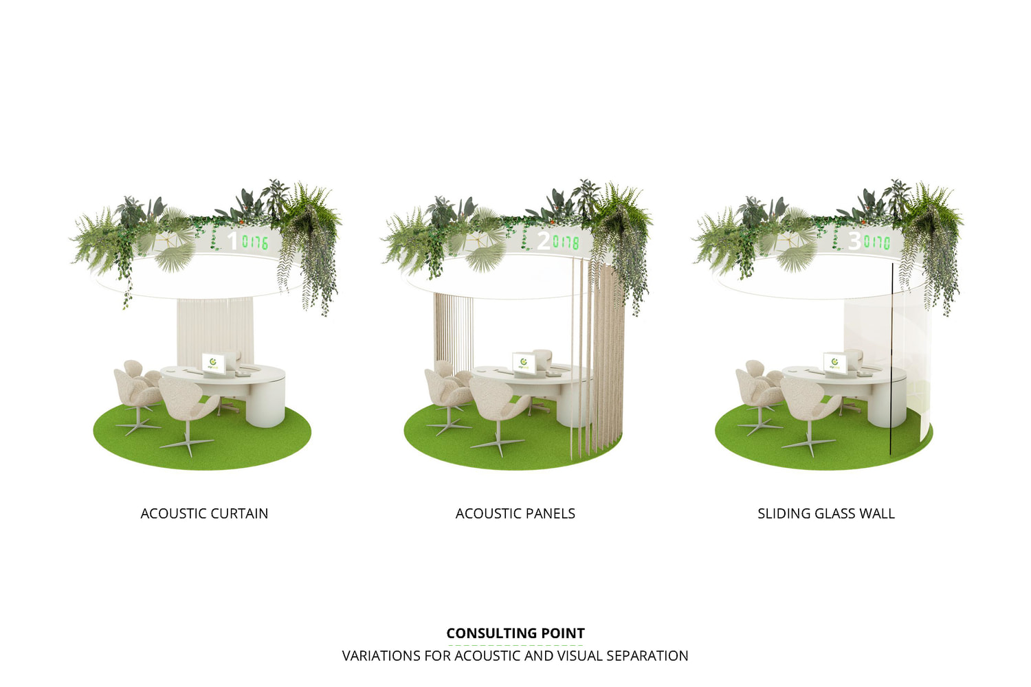
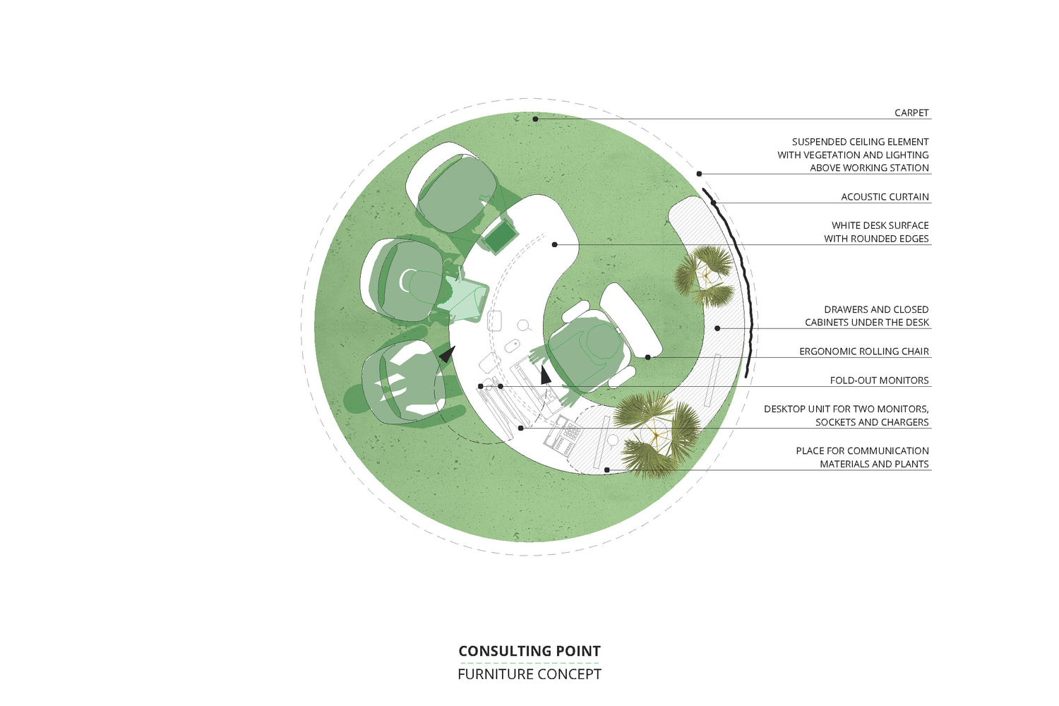
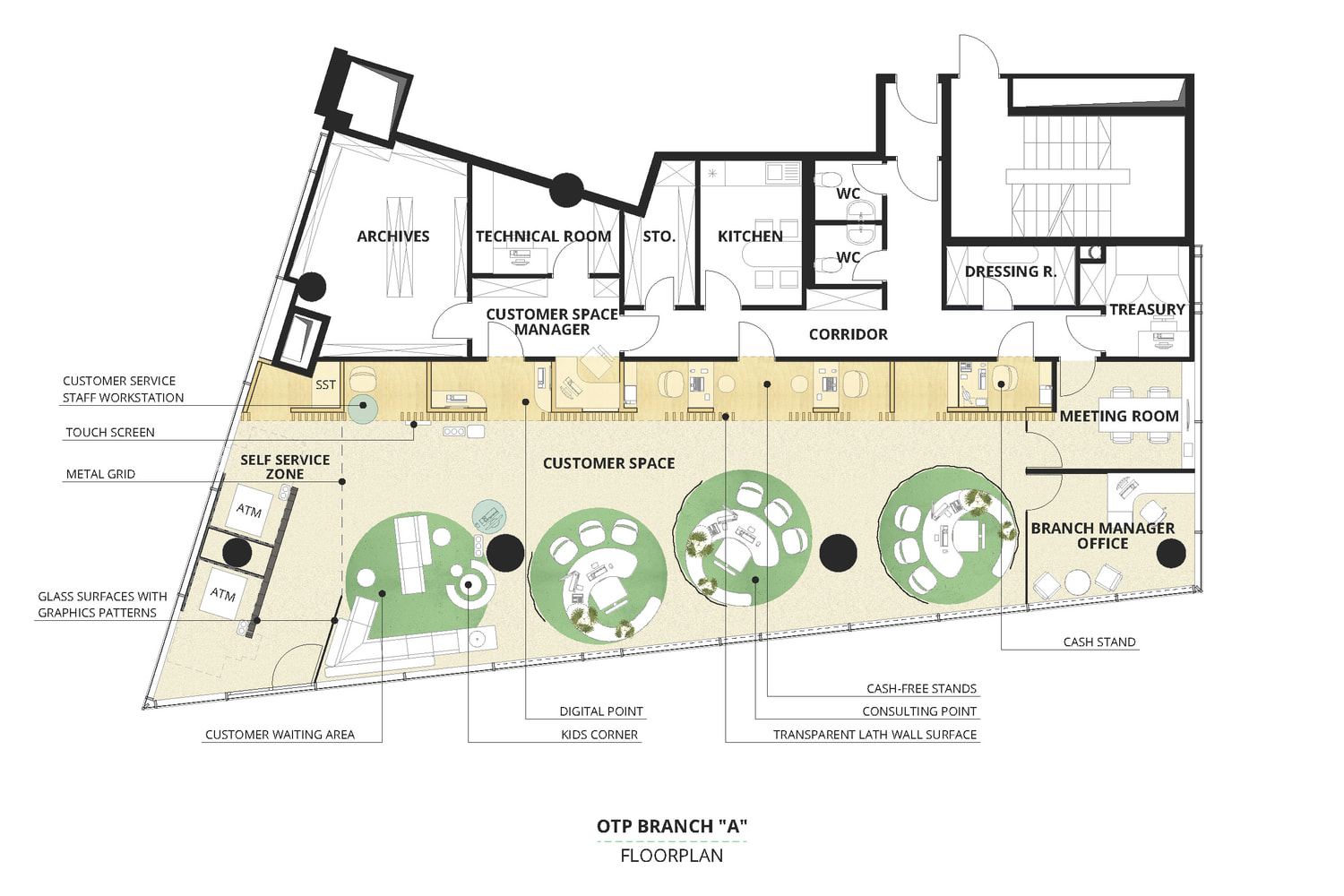
Since the comprehensible, partnership-expressing design was a basic requirement, we gathered materials, feelings, decor, and graphic elements around four ideas – friendly, homelike, familiar, easy – to illustrate them. In addition to general comfort, they also support the functional separation of the two types of customer traffic. Short transactions can be made in the fast service lane behind a wooden slatted wall, while longer ones can take place at the freestanding
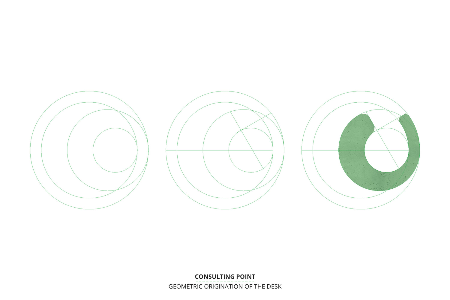
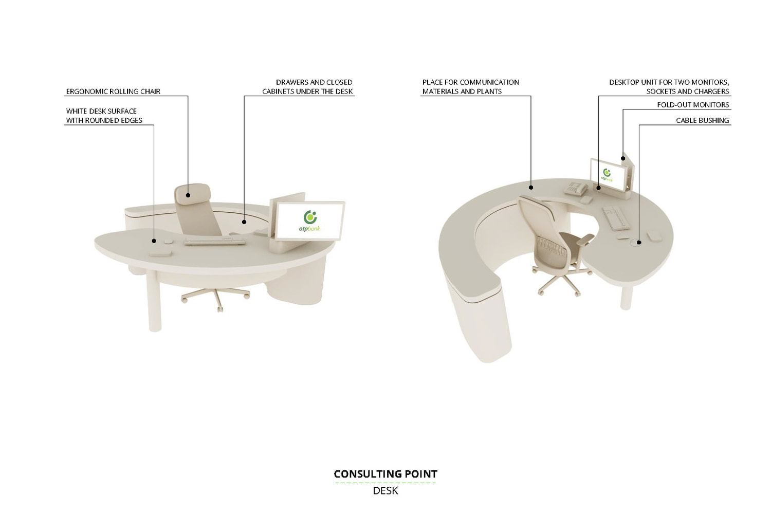
workstations. The furniture concept of the consulting stations derives from the well-known brand identity colours and round shapes. Their ergonomic setting supports shoulder-to-shoulder customer service and pays attention to users with special needs. Their partitioning curtains made of acoustic textile can provide discretion. Details such as plants on the top of the client number displays instead of the floor, drapes, or the images of familiar towns screen printed on glass surfaces enhance the homey atmosphere.
The concept is easy to apply flexibly in other branches of the network, and the relation between customer zones can vary by the emerging needs at a little cost.
Interior design concept: Nóra Pajer, Noémi Soltész / 2019
Team: Norbert Juhász
Project management: Stay in Hungary
Client: OTP Bank Nyrt.
Size: 180 - 400 m2

