Design sample for Lechner Knowledge Center
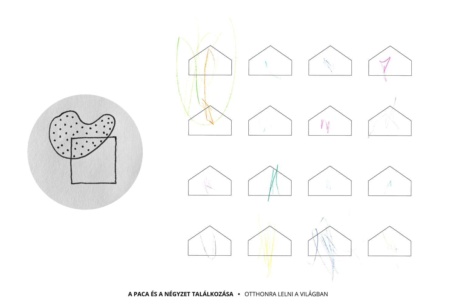
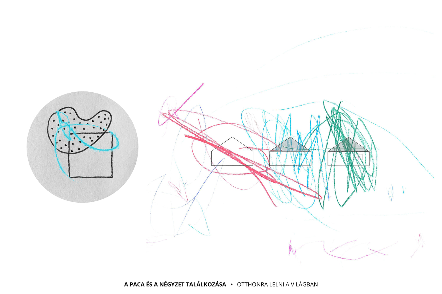
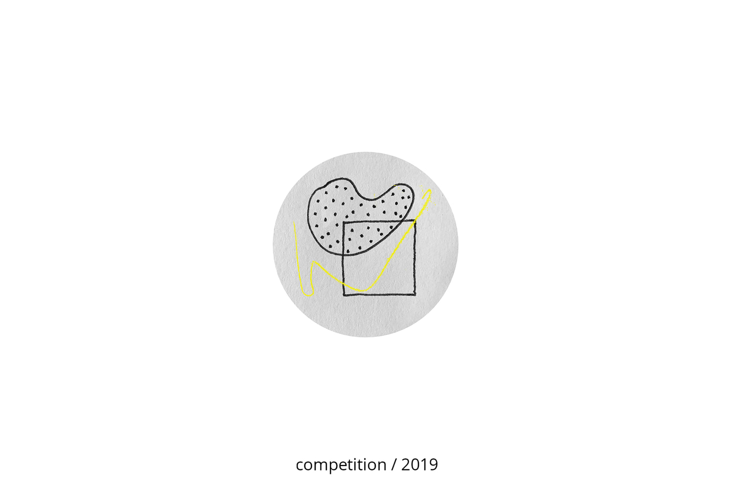
Just as the splotch meets the ruler drawn lines of the square on paper, a child comes into contact with the norms of society in the nursery – this is the first step on the long road to socialization. The jury of the competition in 2019 honored our project for its unique thoughtfulness, functional layout and consistent interior design. In 2021, at the request of the Lechner Knowledge Center, we prepared building permit and implementation drawings based on the original concept.
ARCHITECTURAL CONCEPT
Our human existence thrives on the community. While the first period of our lives is about bonding with our mother and our family, the nursery is where a young child first enters the world of institutions. We take the first steps here on the long road to socialization, this is where the child first meets society in an institutional form. Their personality is slowly becoming independent, and starts to find out more about the rules of society and the …
Design sample for Lechner Knowledge Center
Just as the splotch meets the ruler drawn lines of the square on paper, a child comes into contact with the norms of society in the nursery – this is the first step on the long road to socialization. The jury of the competition in 2019 honored our project for its unique thoughtfulness, functional layout and consistent interior design. In 2021, at the request of the Lechner Knowledge Center, we prepared building permit and implementation drawings based on the original concept.
ARCHITECTURAL CONCEPT
Our human existence thrives on the community. While the first period of our lives is about bonding with our mother and our family, the nursery is where a young child first enters the world of institutions. We take the first steps here on the long road to socialization, this is where the child first meets society in an institutional form. Their personality is slowly becoming independent, and starts to find out more about the rules of society and the operation of an institution. The interaction of these two worlds creates a very inspiring atmosphere.
This relationship is nicely depicted in young children’s drawings - where the lines flow freely and without boundaries, whether they are the edge of the paper or the outline of a shape. This is where the splotch meets the strictly drawn square, just like the child meets the cultural community around them. These two elements were the inspiration for our concept: the interactions in the socialization process and how they are visualized in drawings.
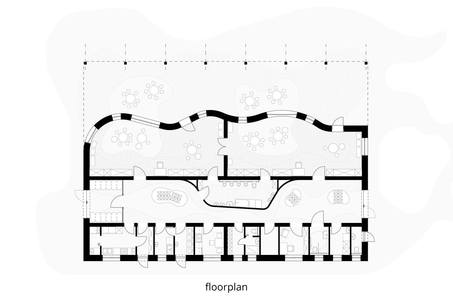
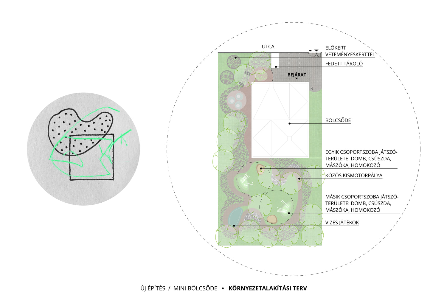
Our architectural concept is defined by the intersection of a rectangular geometric building and a garden without any straight lines. The seemingly random patches of tiled and green surfaces flow into the childcare rooms and the changing room but they stop at the walls. This is the space where these two worlds collide: the clean and straightforward right angles and the abundantly flowing curves. This creates inspiring and playful spaces that are scaled to fit children perfectly.
BACKGROUND AND INSPIRATION
The aim of the competition was to develop nursery concepts that are thoughtful, represent high architectural quality, and could serve as a model for future investments. We focused on the event when a child starts the long process of integrating into society after leaving their close family circle. The nursery is the first stage of secondary socialization, where the child meets the cultural community around them. This is where the splotch meets the square: the child is a unique individual and the nursery is an institution made of rules and order.
The purpose of education in the nursery is that young children acquire the skills and abilities that help them to behave in a balanced way in their own cultural environment. It is important that the nursery is a fun place to be, and encourages young children to learn and participate. Our goal is to lay the foundations for a concept that is well-suited to most urban environments, providing modular, scalable and tangible support for anyone looking to set up a nursery.
SHAPE AND VOLUME
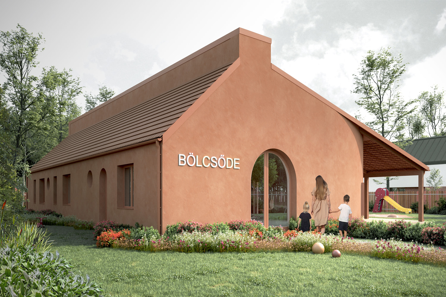
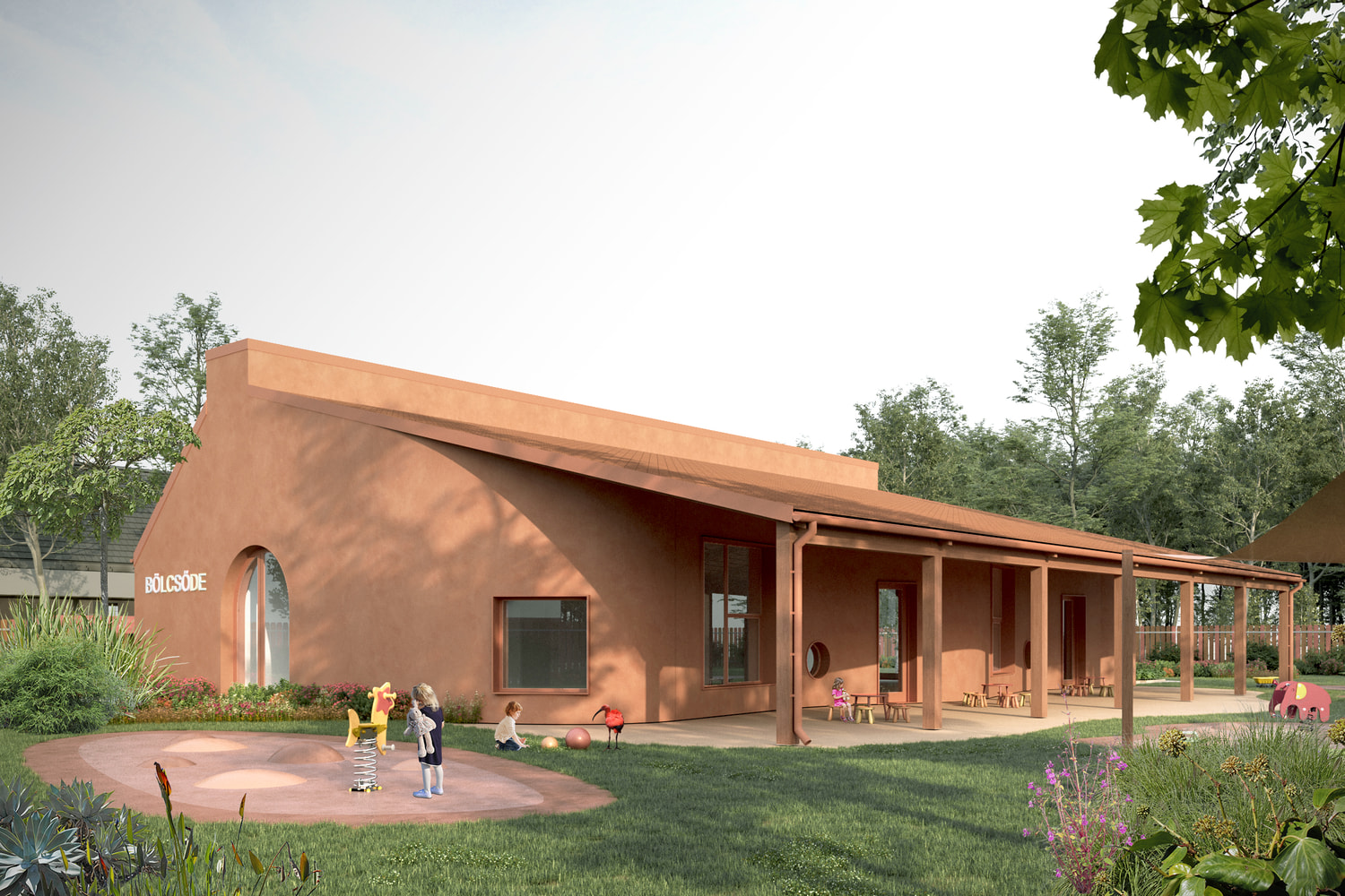
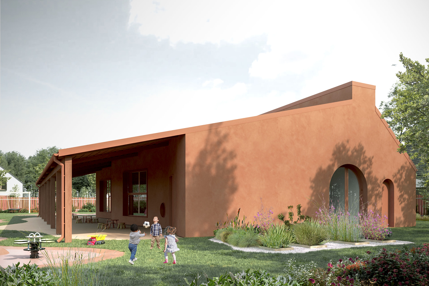
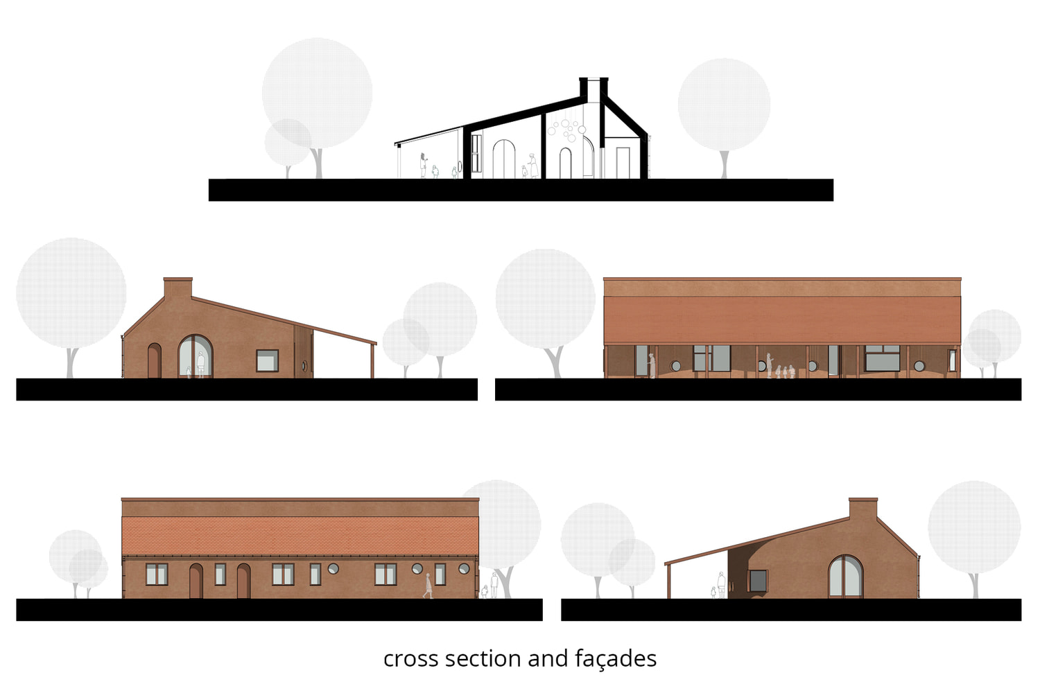
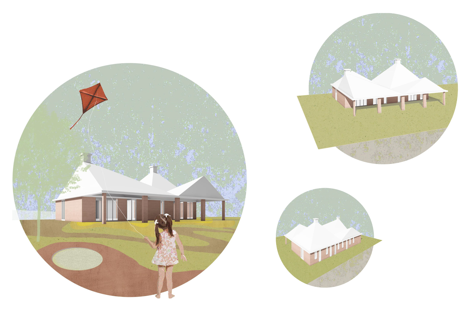
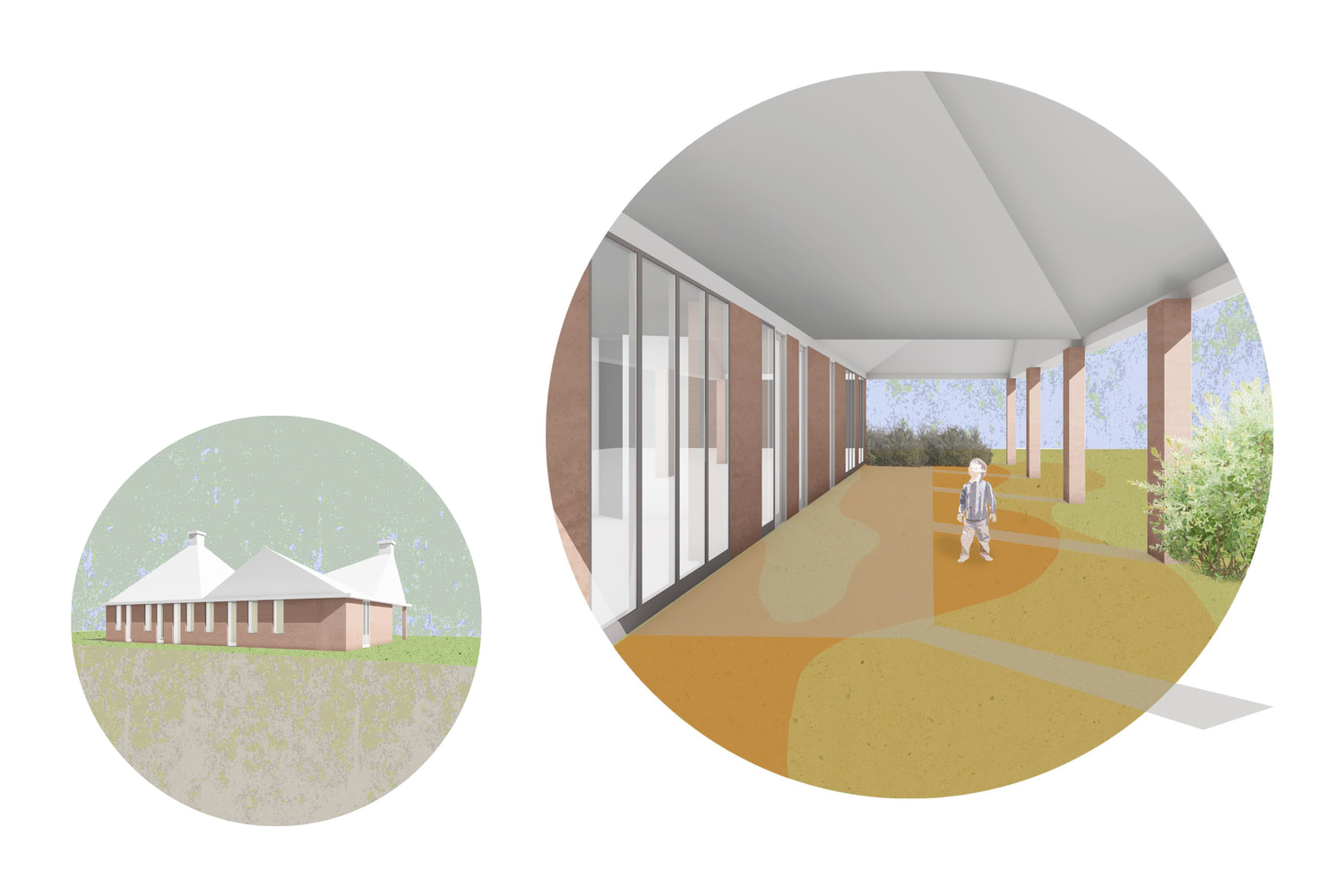
In our proposal the different variants – the new construction, the expansion and the cube house – share the same shape. The backbone of our concept is a simple rectangular shape that is completed by a playful roof structure and homogeneous colors and texture. With lined up shapes and the changing position and height of the roof we created a contemporary design that originates from a traditional pitched roof house. When redesigning the cube house, we kept the characteristic pitched roof shape and added ½, 1/1 or 3/2 sized modular elements to create the right size for each type of use. We created a simple and strict design with playful details for this set of contemporary buildings, with red toned plaster façade and white sheet metal roofing. The shape and layout of the doors and windows follows the function: they create a strict, more solid façade facing the street and they open up the playrooms toward the covered patio and the garden with large glass surfaces.
FUNCTIONAL ORGANIZATION, SPATIAL CONNECTIONS
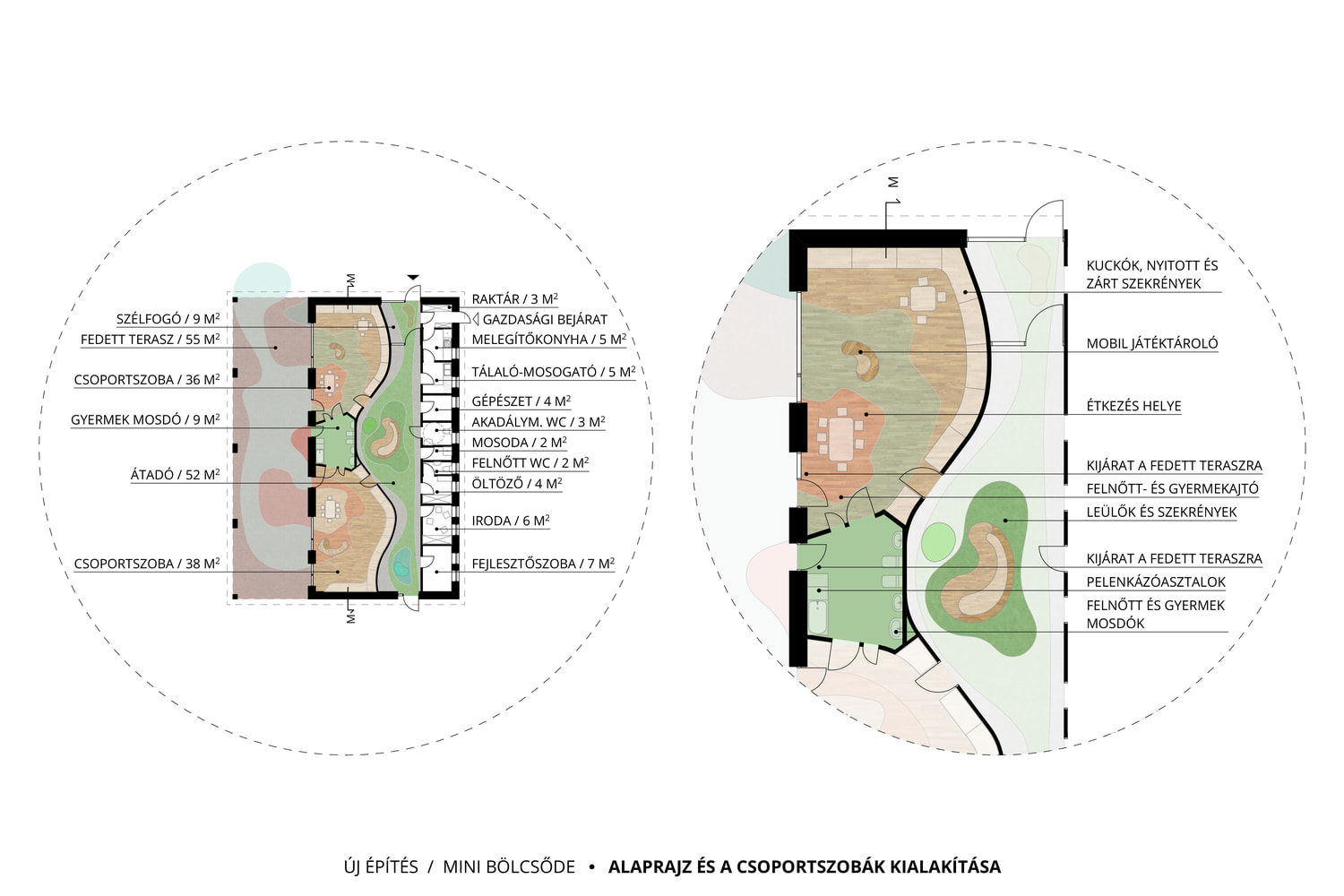
Our aim was to create a rational spatial arrangement, where the changing rooms, the childcare rooms and the terraces are interconnected, and are also emphasized in the layout. This connection is strengthened by the interior design as well: the green spaces flow into the changing room and the childcare room, but this flowing motion stops at the walls and turns into strict right angles. The childcare rooms are in the focus, but the changing room has an important role as well: it has to be big enough for multiple families if they arrive at the same time, it has to offer space for parent-caregiver interactions, and be a visually separated, comfortable waiting area for parents during familiarization.
We started with the 9,5 m grid of the traditional cube house at both the newly constructed and the expansion versions. One educational unit is exactly the size of two cube houses plus an added terrace in the size of a half grid. The building is one educational unit, but more units can be added lengthwise if a larger building is needed. The spatial arrangement of the different cube house variations helps create a compact space for a small nursery or a family daycare with the least amount of modification. We gave two examples for the small nursery: one with one and another one with two childcare rooms. The family daycare has four variations: with one, two or a maximum of three childcare rooms, and one with a childcare room plus a development room.
INTERIOR DESIGN
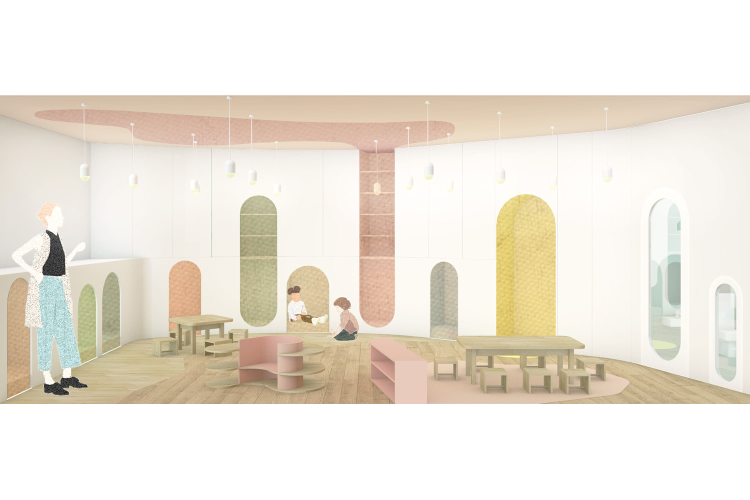
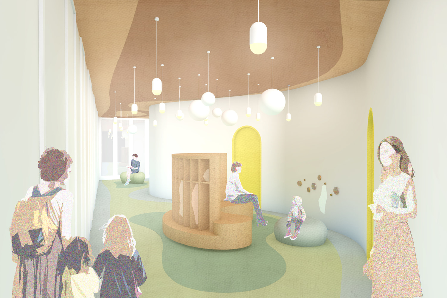
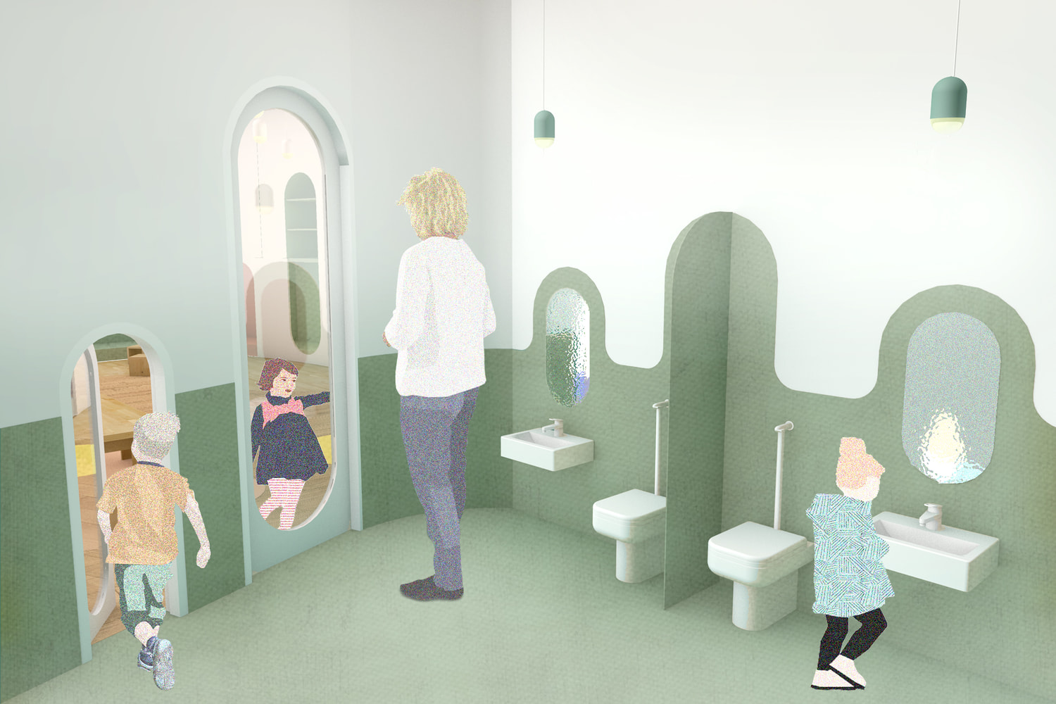
The concept of the splotch colliding with the square appears in the interior design of the childcare rooms and the changing rooms as well. The flowing lines and splotches of the outdoor spaces get into the rooms, on the floor and also sometimes on the walls and on the ceiling. This is where these two worlds really collide: the strict right angles and the freely flowing lines. This collision creates playful and inspiring spaces, and everything is scaled to fit the size of the children.
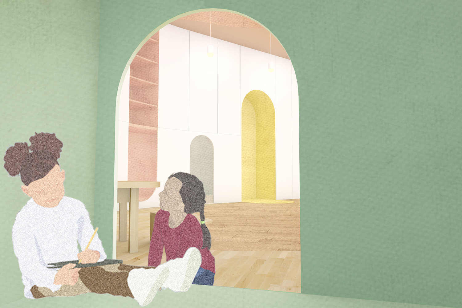
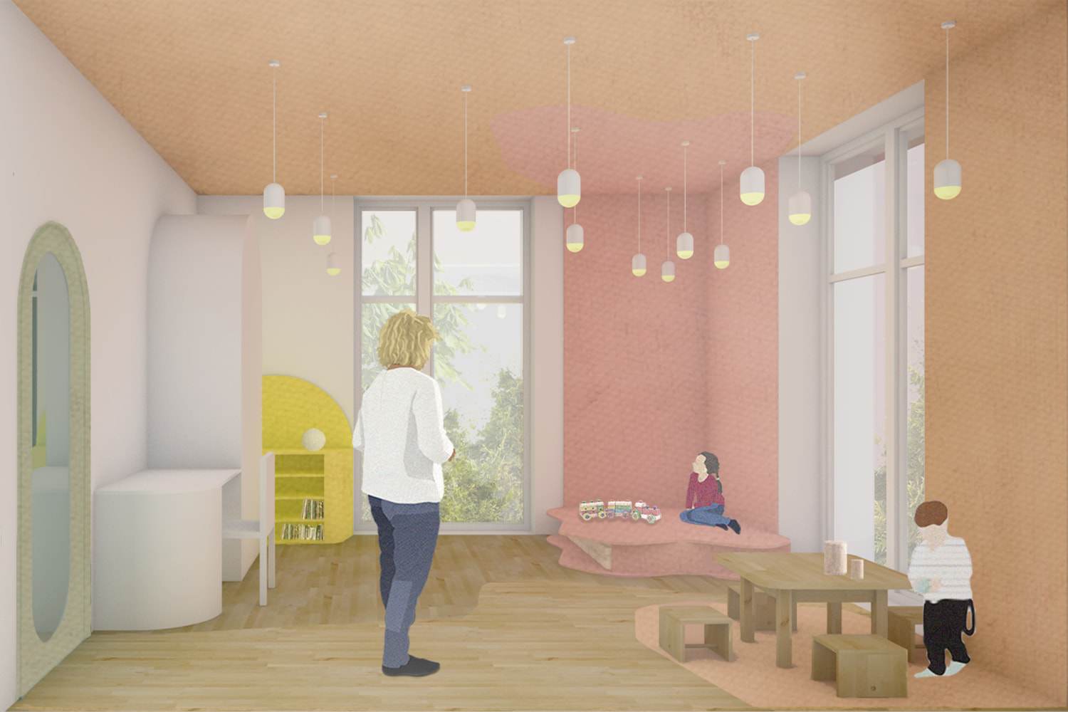
The walls of the childcare rooms are painted either white or another very light color. For the floors we proposed a natural wooden flooring where the dining area is marked with a linoleum insert and the ceiling is a light pastel color. The upper cabinets of the white cupboard that runs along the curved wall of the childcare rooms are closed in, and the lower cabinets are open shelves and cosy little nooks for the children. Each childcare room has eight of these nooks, so every child can have their own space to retreat to during the day, while still remaining visible to the caregivers. It is especially important for sensory children to be able to hide from the overflow of stimuli in such a lively environment. Each and every little nook has a different pastel color, the beds have their designated space, so there is no need to pack them away every day, and the openings are big enough so that they can be removed for cleaning. The bigger part of the childcare room is for playing, all of the furniture is mobile, the layout is flexible. The afternoon nap takes place on the covered patio if the weather allows it. It is common in nurseries that the children take their afternoon nap outside in sleeping bags and special beds even if it’s as cold as -5 degrees. This way they can get used to sleeping in daylight to the noises of nature, and sleeping is much more restorative for them outdoors.
The curved wall of the changing room creates a dynamic division in the space. The childcare room doors are also curved on this wall, but the doors on the other, straight wall are more strictly drawn. The walls are painted white and the floor has patches of linoleum in different colors. These patches mark the area of the lockers. The paint on the ceiling also follows the flowing lines of the room. We designed some comfortable seats for adults here along with the lockers and wall hangers that the children use.
GREEN AREAS AND PLAYGARDEN
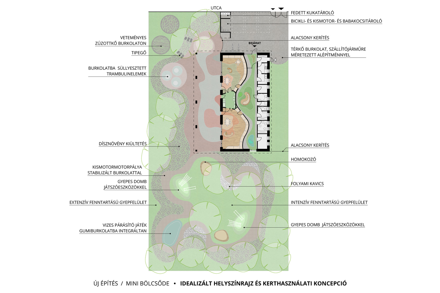
Our concept of the splotch colliding with the square is best observed in the garden where the rectangular building meets the organic, irregular lines of the outdoor spaces. The paved and green areas flow into one another, and these carefully designed but random-looking patches flow into the indoor space of the childcare rooms, but only until they reach their walls. Our inspiration for these flowing lines were children’s drawings as well as the works of Brazilian avant-garde and modern landscape architect and artist Roberto Burle Marx. His works are summarized in four principles in Rossana Vaccarino’s book about him: local vegetation as the structural element of the design, breaking up symmetry in the spaces, colorful pavement and the freely flowing lines of water surfaces.
Every childcare group has their own little playhill with a wide slide, a climbing frame, a separate shaded sandbox and a river pebble surface for barefoot activities. Every piece of equipment is lower than 1 m, so there is no need for elastic paving underneath, and they can also be placed on the grass. We made sure that grassy areas along with the group play zones are not bigger than 10 m2 per child, so they feel comfortable in the easily comprehensible green spaces that they can roam. The separate group play areas are framed by a toy bike course with a stabilized poured pavement. We designed in-ground trampolines and different ground covering structures that rhyme with them. There will be a water unit in the garden, which is a widened area with a mist arch with the toy bike course flowing through it. The in-ground mist sprayers and a paddling pool is optional. Since there will be ornamentals along with the extensive turf, there is no need to plant hedging along the fence. The vegetation is diverse in both the types and the color, which provides a nice microclimate and clean air for the children.

